Theo’s Coffee
Visual Identity, Logo, Packge design
The Problem
Theo’s Coffee needed a brand system that could feel both premium and human — something contemporary enough to stand alongside modern specialty coffee brands, while still reflecting the warmth, craft, and community-centered spirit behind the company.
The challenge was creating a visual identity flexible enough to live across physical products, social content, merchandise, and future brand growth while helping the company stand out in an increasingly saturated coffee market.

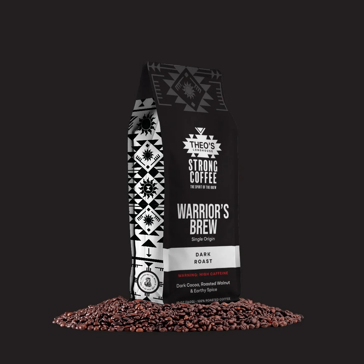
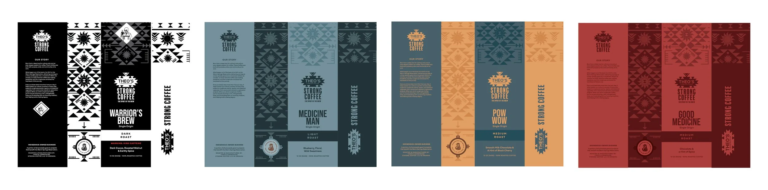
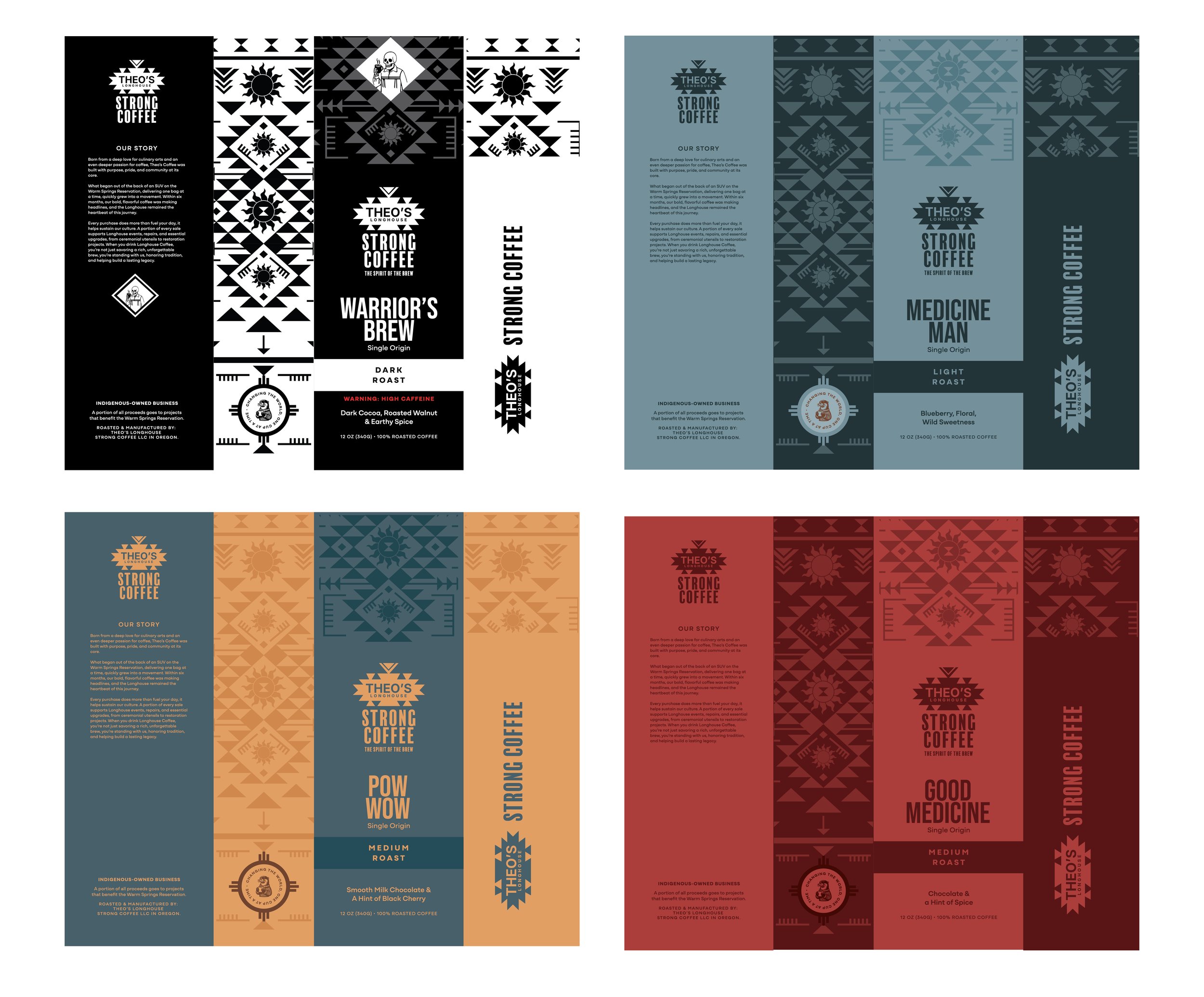
The Solution
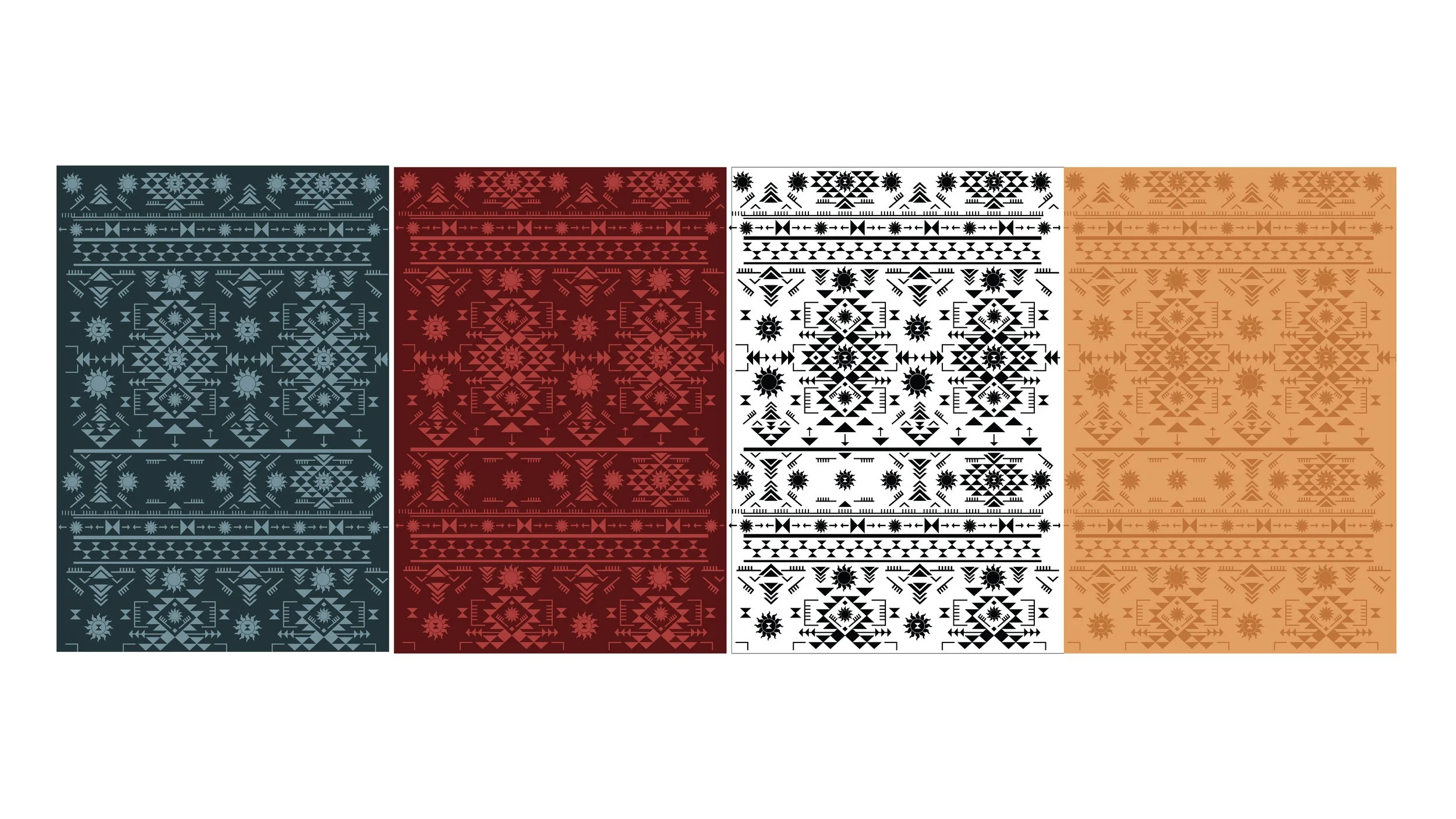
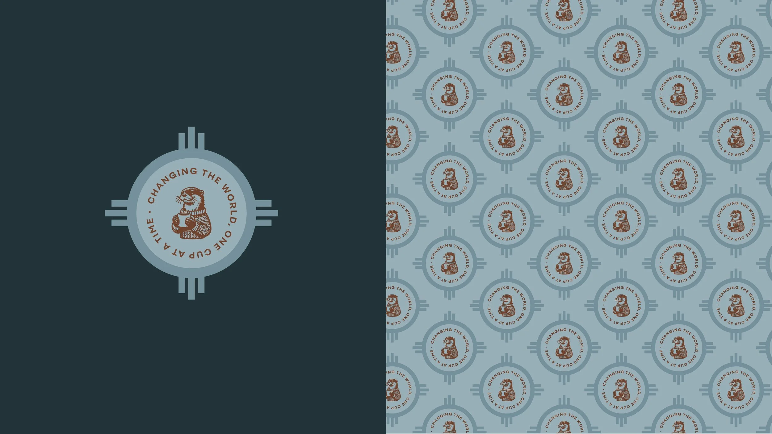
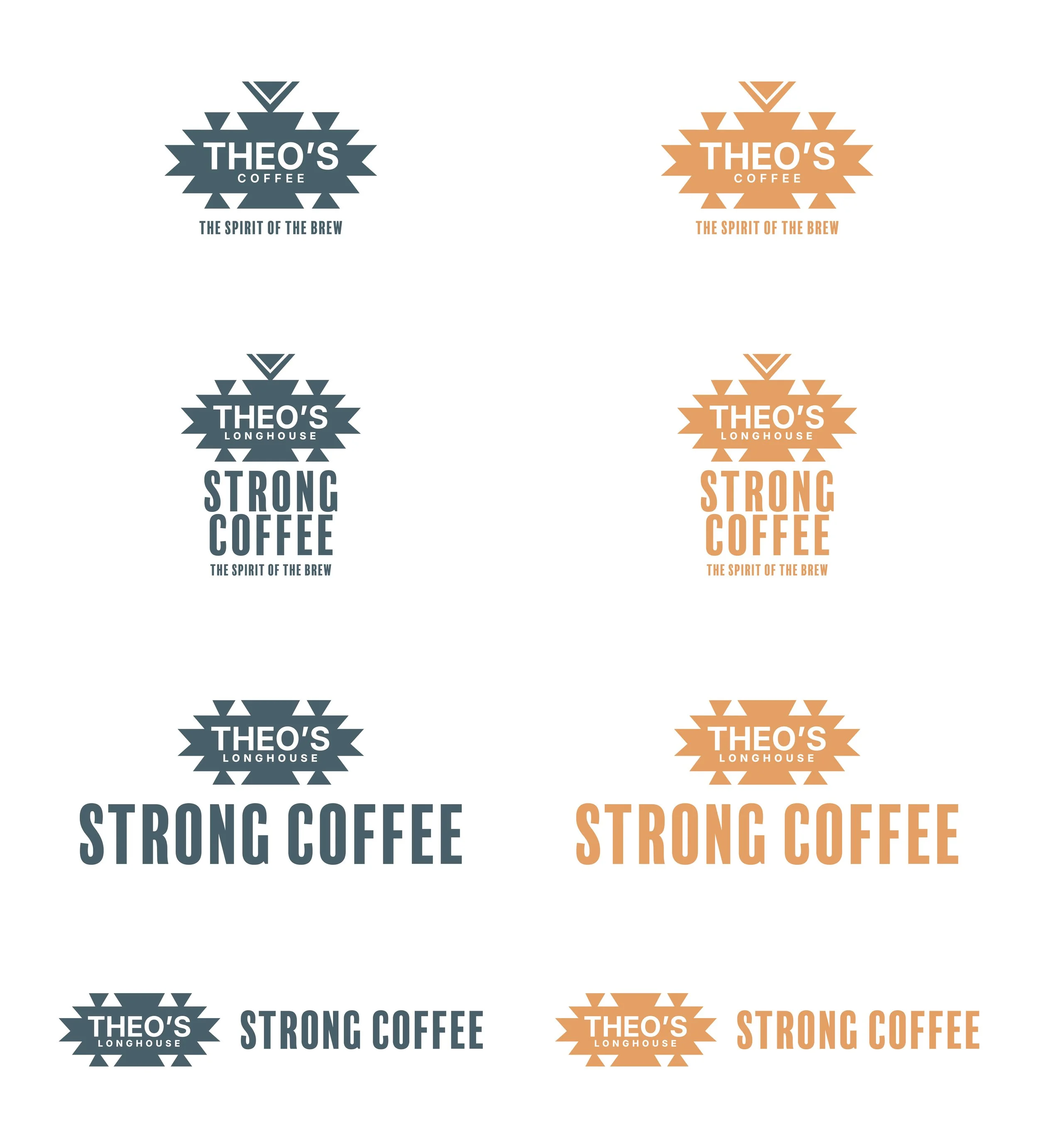
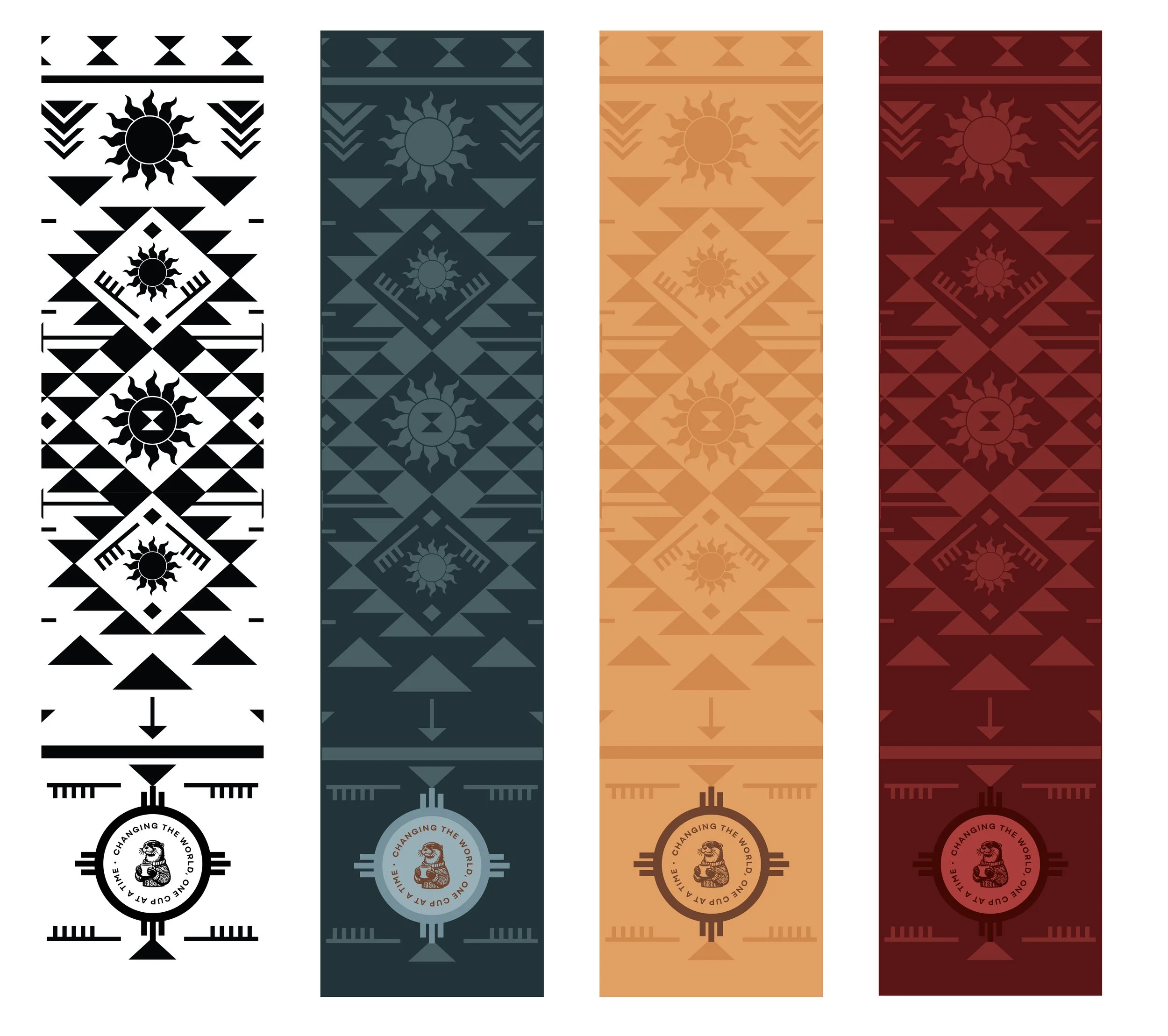
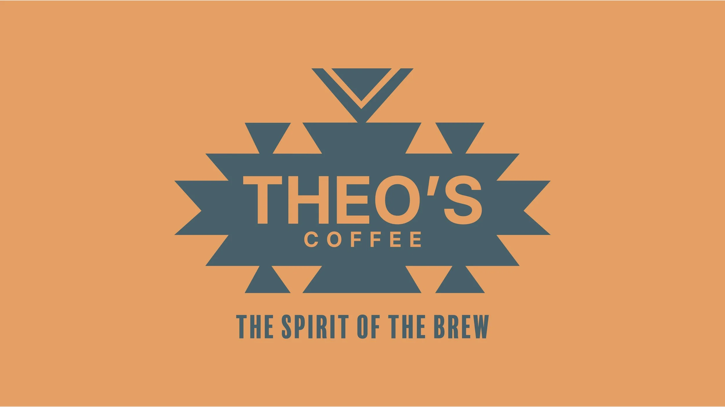
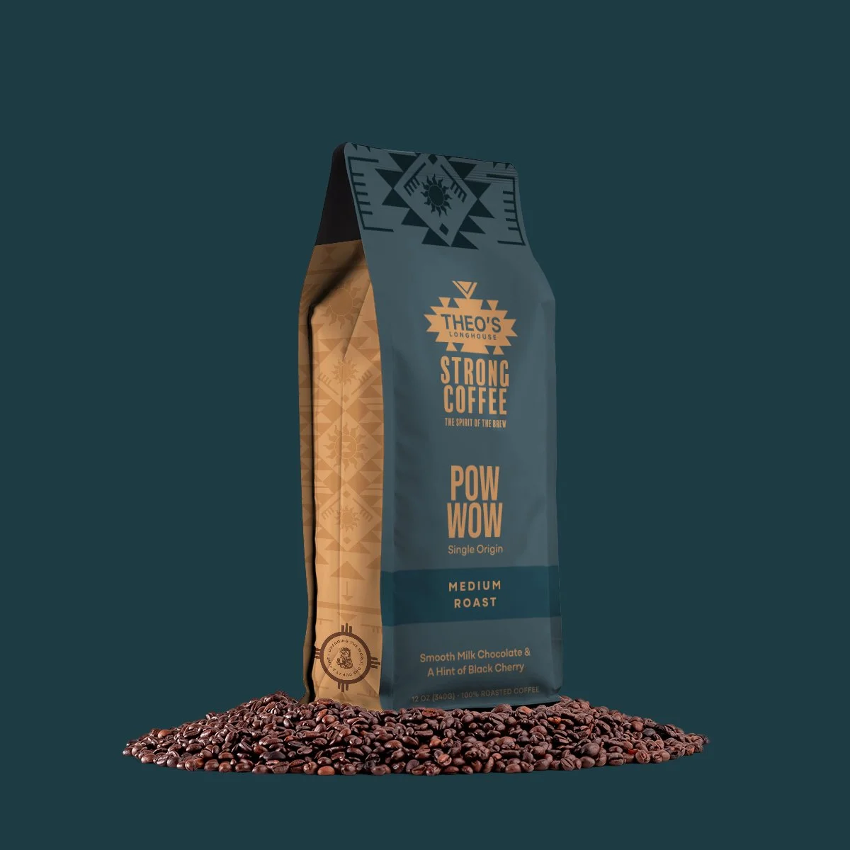
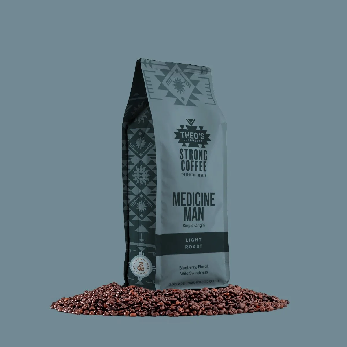
We developed a visual identity system rooted in contrast: bold typography, tactile patterns, and a refined color palette that balanced energy with approachability.
The work included logo refinement, packaging design, campaign graphics, and a scalable visual system designed to evolve with the brand over time. Every touchpoint was considered as part of a larger ecosystem — creating consistency across print, digital, environmental, and social applications.
The result is a brand that feels contemporary, optimistic, and distinctly ownable while supporting Theo’s long-term growth and storytelling ambitions.
The result is a scalable brand ecosystem designed to evolve across physical and digital touchpoints while giving the company a distinctive presence within the specialty coffee space.